Introduction
I first came here in Aug 2017, and I was excited to learn about New York City, then I got to know about (NYC.GOV). It is one of the most popular websites which is often used by a diverse group of people.
NYC.gov achieve the goal of fitting an enormous amount of information but also faces issues of Information redundancy & tedious Scrolling and Browsing, Information Prioritization and Confusing Labels to reach the target information
Role
In a team of three, my role was to redesign the Homepage of (NYC.GOV) by improving its Navigation and reducing the redundancy on the base of User Research by using various techniques such as persona, Card sorting, Content Inventory & Self Benchmarking to improve the sitemap.
Asset Required
Software: OmniGraffle, MS Excel, PowerPoint, G-Suit
Techniques: Card Shorting, Wireframing, Self Benchmarking, Content Inventory, Personas.
Time: 3 weeks
Team: Aanshi Shah, Kajal Purwar, Nishant Kadu.
Problem 1
Users observed information redundancy across global navigation.
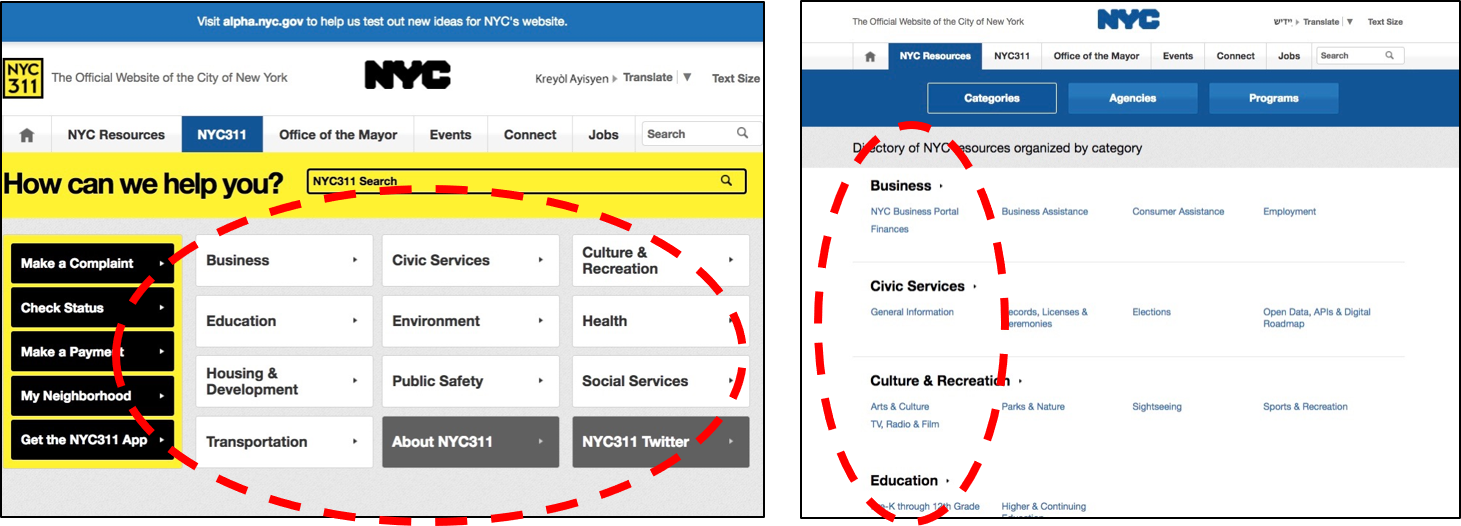
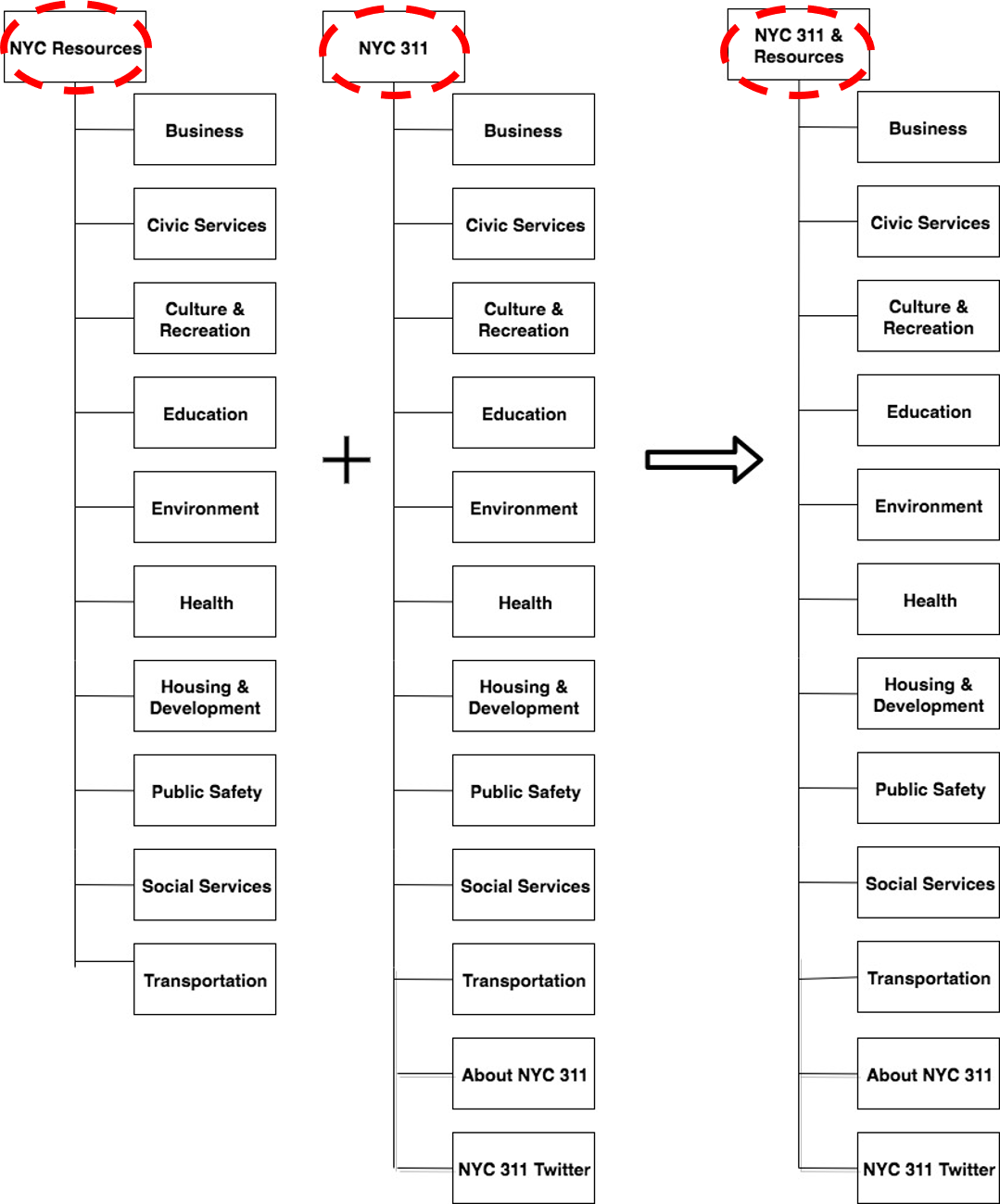
NYC resources and NYC 311 both are having the same name on menus also when we clicked on it, get the same page and replicated information on it.
Approach
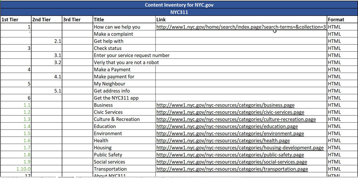
Content Inventory
Card Sorting iteration 1 & 2
Number of Users: 15
Users Location: NYC
User Type: Citizen/ Students/ Teachers and immigrants
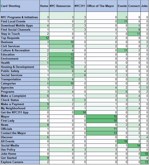
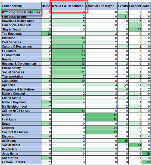
Iteration 1 Iteration 2
Solution
Combined menus without information loss
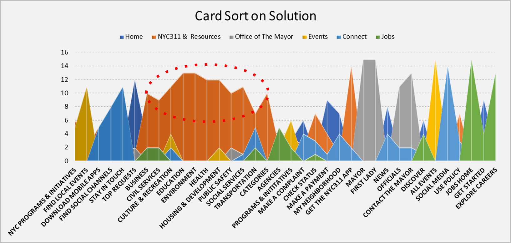
As per Card sorting result, we found that there are a majority of options which are repeating in NYC Resource and NYC 311 which can be combined into one option NYC 311 & Resource.
Problem 2
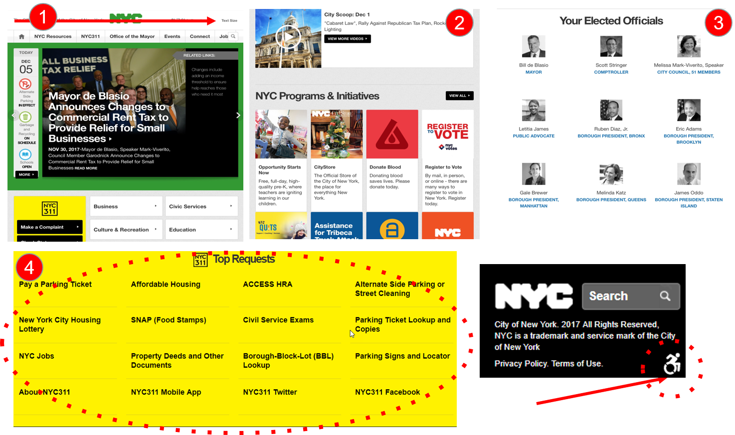
‘Top Request section is at the bottom of the page’
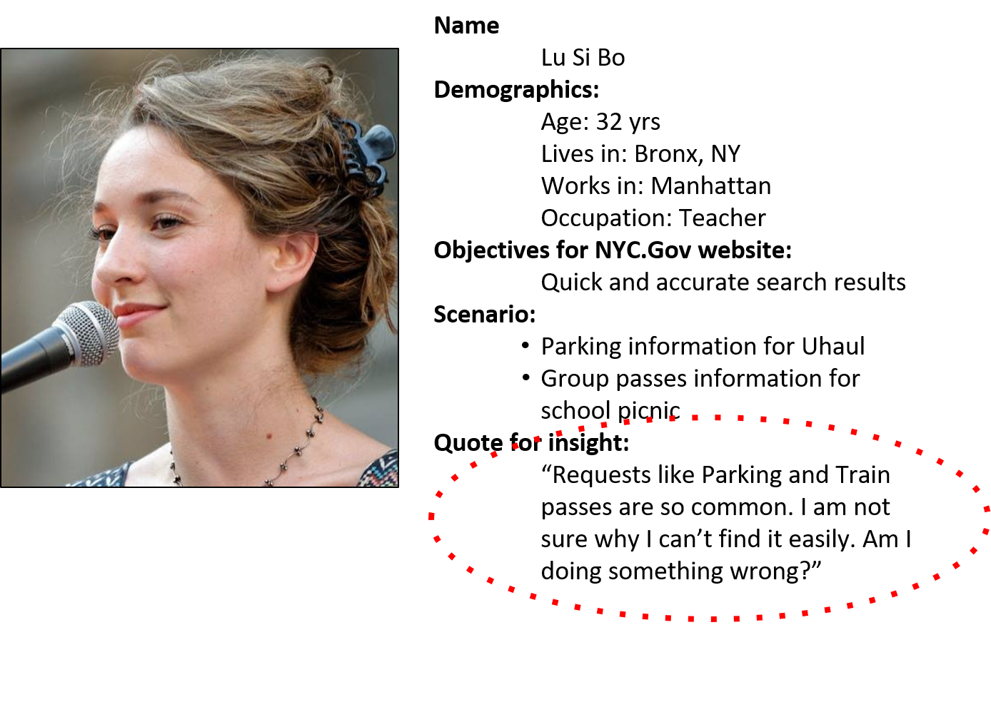
Persona
Approach
Competitive Analysis- Benchmarking
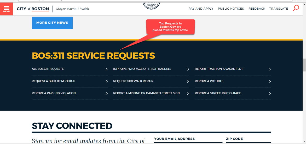
Our Suggestion for Top Request
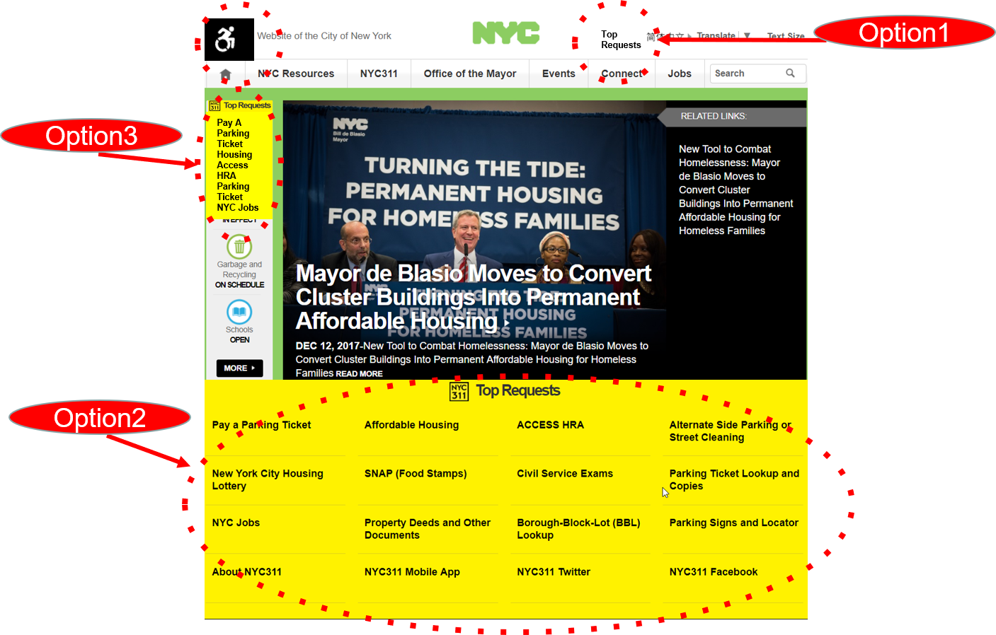
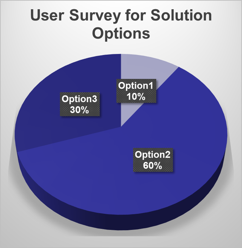
After conducting the survey with three different layouts with different "Top Request" location.
Clearly, "Option 3" is a more desirable location for TOP Request according to the users
Solution
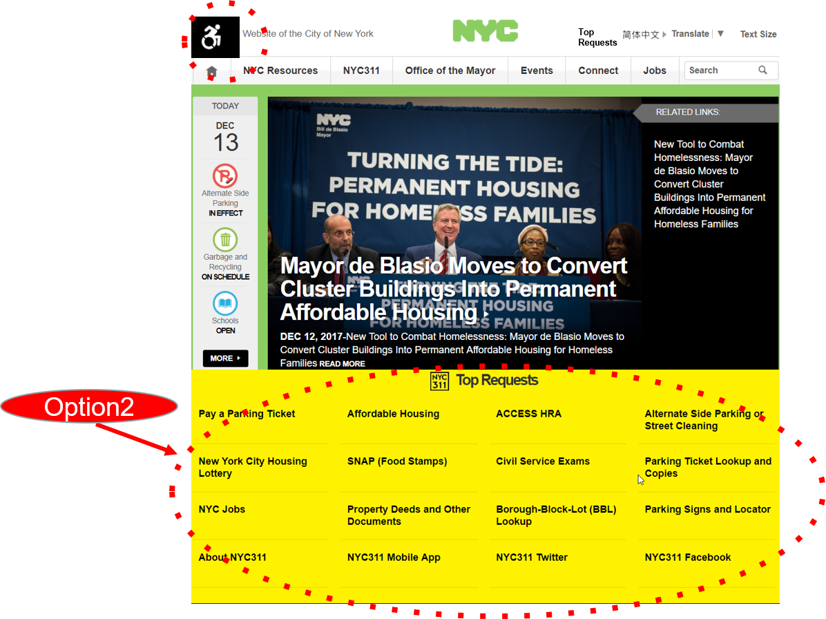
Top Request section should be towards the top of the page’
Problem 3
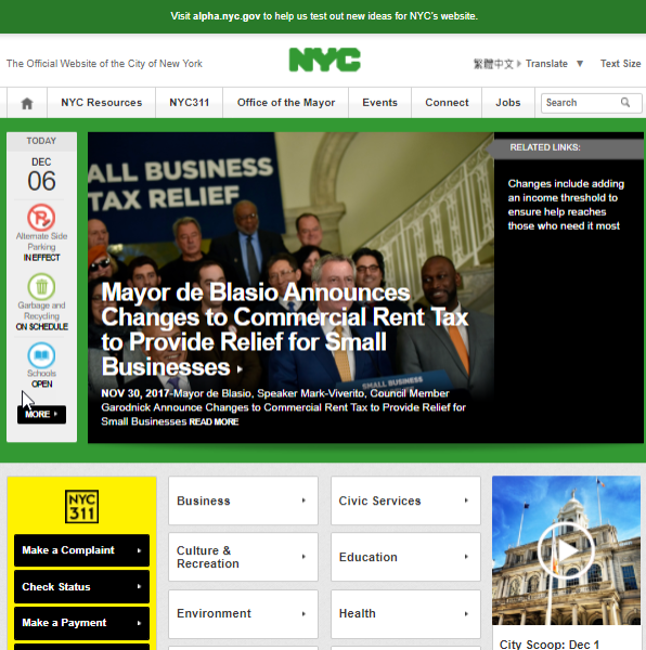
Users wanted alerts to be highlighted but Alerts were entirely missing on home page
Approach
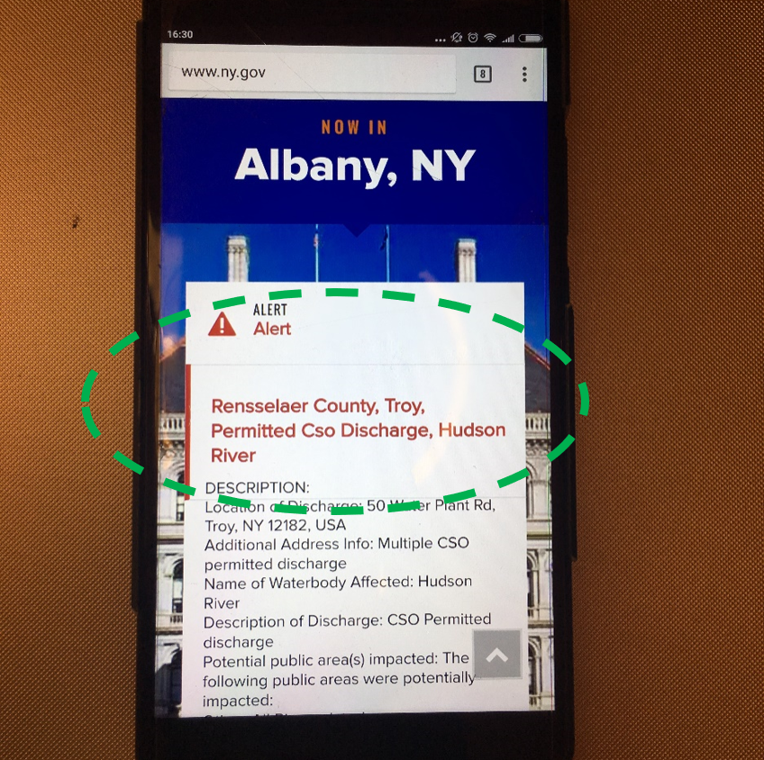
Self Benchmarking Mobile Version of website contained alerts
Solution
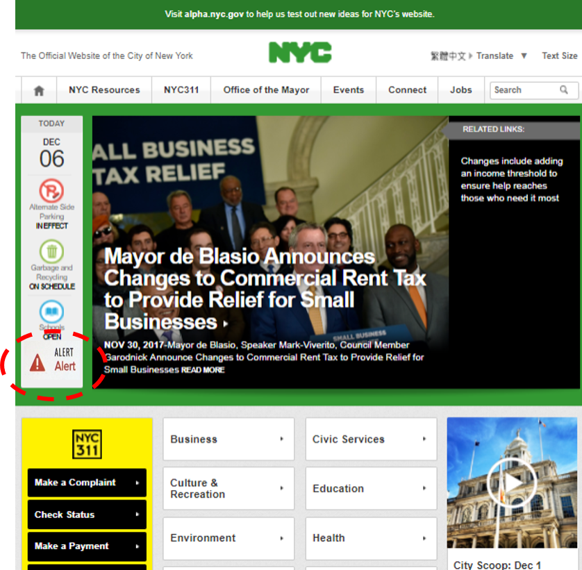
Based on competitive analysis, Alert should be included in TODAY column as it has the same importance.
Findings
- Solved redundancy and information overload
i. Combining menus without information loss
from wide and deep => narrow and deep
- Prioritized information
i. Brought the ‘Top Requests’ section towards the top of the page with better visibility
ii. Suggested Alerts to be displayed on the home page as implemented in the Mobile App